March, 2019 by Alireza
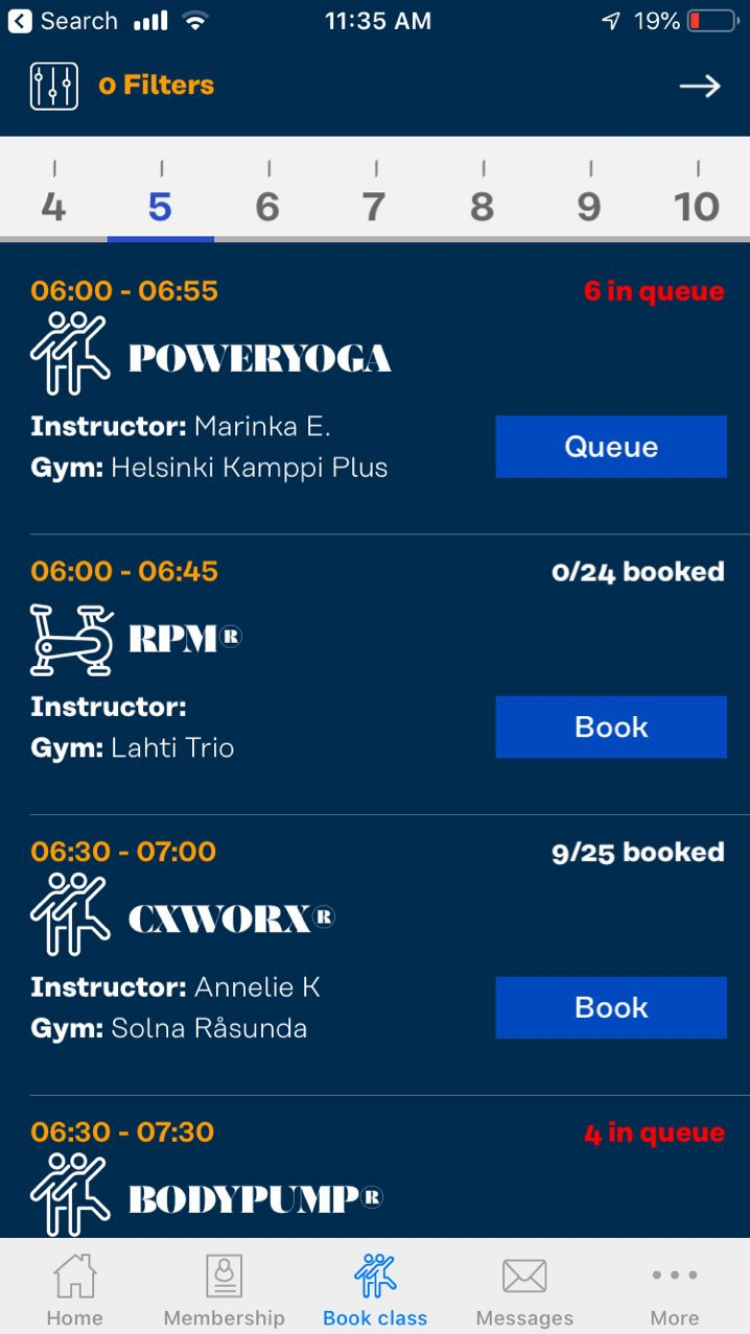
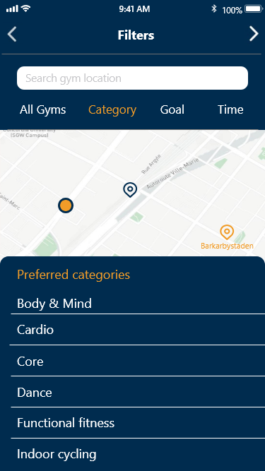
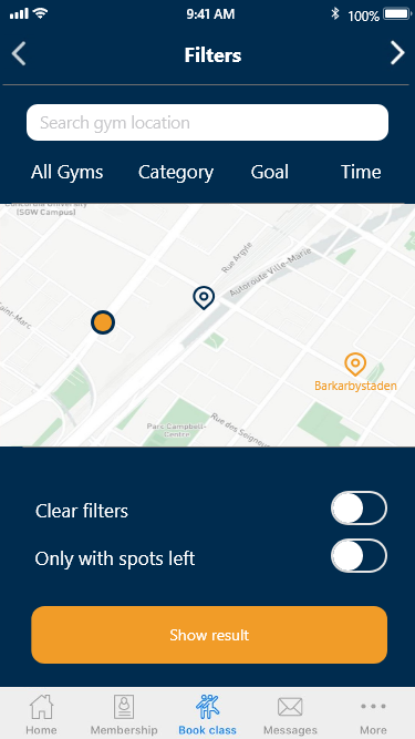
There are different filters when a user wants to book a group training class in 24 seven mobile application: Location, Time, Goal and Category.
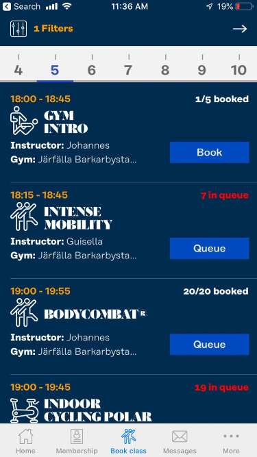
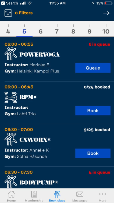
After choosing the willing choices, user can see the classes and book a class. The first problem in the current app is that
there is no menu bar in the interfaces and user can not navigate in the app while choosing filters. The second
problem is that the user needs to go to different pages to set different filters so after each selection the user have to go back to the main filter page either to choose new filter or to finalise the process.
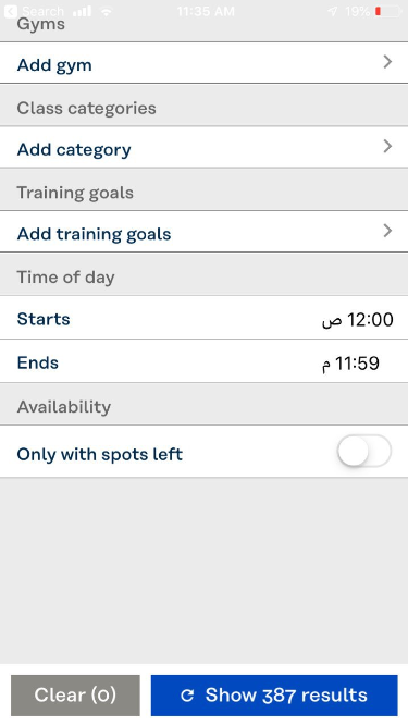
Problem
Solution
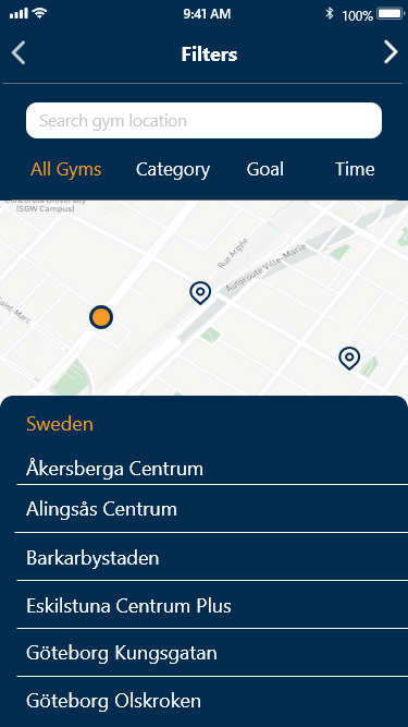
In my design all filters are in one interface and the user
can choose the option from diffrent filters in the same interface. There is also a menu
bar in each interface. in addition the user can see the location of gym and choose the
gym either from the list or map.
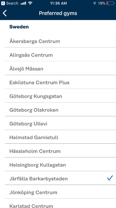
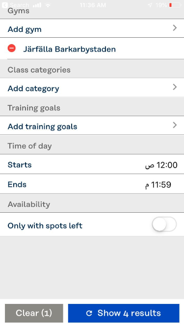
Choose Location
In the design solution for choosing location the
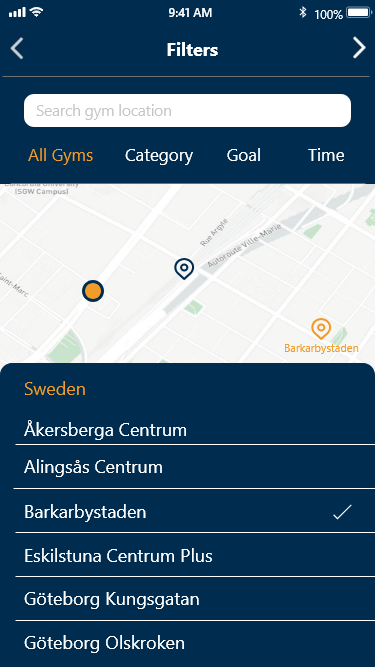
user tap on all gyms and then the menu appears
with all gyms lists. In the example the Barkarbystaden is chosen.
The user can choose it either from map or the list.
After choosing the gym the chosen gym will be highlighted on the map.
It is also possible to choose the gym from the map.
Choose Category
In the current scenario user chooses to see the categories and after that continues to the booking process.
February, 2019 by Alireza
“When you see something so disturbing you want to forget the sight of it, but you can't.” is the definition by dictionary for can’t unsee. There are lots of visual elements that we should consider in our design. Consistente icon style, vertical text alignment, subtitle text contrast, placeholder text contrast and a lot more. Cantunsee.space is a website which give us the chance to compare two interfaces and choose one as the correct design. It is always good to look at two versions and compare them to improve design skills and sharpen our eyes.
February, 2017 by Alireza
Motion and transition can convey lot of information that would be lost without using them. They can be part of the story of a logo or a UI design. It is important that the user sees itself in the flow of what is happening in the interface. Like when the user is waiting for page loading, scroll a page or change a tab in navigation bar. The motion and transition can help to the responsiveness of the user interface design. Responsiveness in terms of UI design does not mean the same meaning as we have in web design. In web design we would like to see suitable design in different devices but responsiveness in UI design means that the user sees what is happening instantly, like typing and posting a post in social media, in this way the user is in the fellow of whole scenario and will have better experience . Another feature which is prominent in motion design is the connection of animation to the reality and at the same time communicating steadily to the user. The image post is one example of good experience that I have talked about. The change of animation by clicking on the password box!
January, 2018 by Alireza
One of the major question for me during my studies and even while I was working as web designer was that in what direction should I continue my career? UX designer or Frontend Developer. It is possible to have skills in design and development area but being expert in both would be critical. Thinking about aesthetic and passion for sketching and look at the product generally is different from coding and being more specific. I think it would be kind of exceptional to be expert in both areas in high level but also I think as a UI/UX designer I should have some knowledge about frontend development and new frameworks.